Godrej's GI Logo and the Guerrilla Warfare It Triggered
When a 129-year-old legacy brand rebrands, every detail matters, and the internet sees them all.
Quick Summary
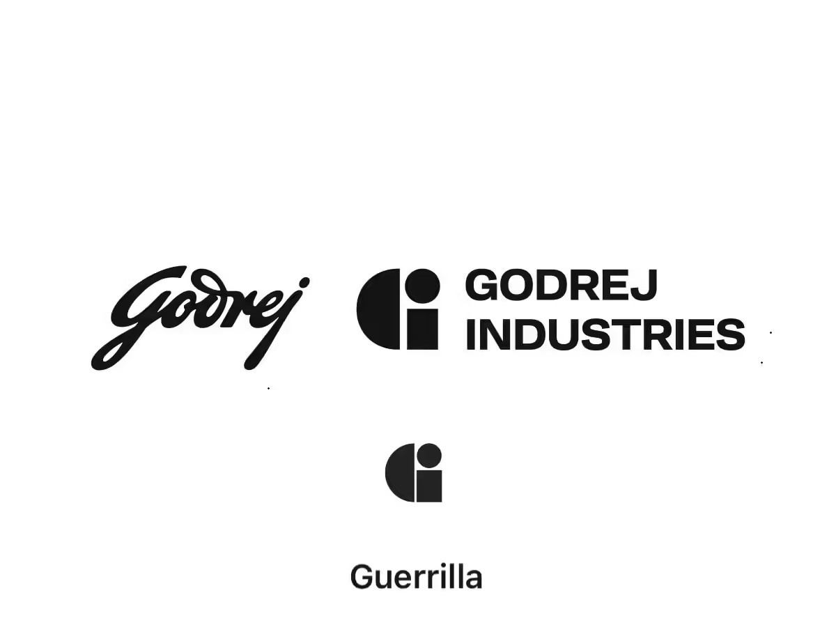
On April 22, 2026, Godrej Industries Group unveiled a sweeping new corporate identity, including a geometric GI mark, a custom typeface called GI Sans, and a sonic identity. Within hours, designers online flagged a visual resemblance to the logo of Guerrilla, a Sydney agency that has used its mark since 2002. The launch quickly became a live design audit. This article walks through what the rebrand was actually about, how the controversy unfolded, what Godrej said in response, and what every designer and brand should take away about due diligence, trademarks, and process rigour at this scale.
On April 22, 2026, Godrej Industries Group took the stage at Godrej One to unveil a sweeping new identity. This wasn't just a logo refresh but a full sensory rebrand, a stripped-back geometric "GI" mark, a custom typeface named GI Sans, a sonic identity, even a signature fragrance. Anchored in the line "Crafting tomorrow since 1897," the exercise pointed toward an even bigger ambition, which is INR 5 lakh crore in market capitalisation by 2031.
But then the narrative flipped instantly.
Within hours, admiration gave way to scrutiny. By the next morning, the launch had turned into a live design audit. The new "G" in the GI mark looked similar to Guerrilla's logo, a Sydney-based independent agency that has used its identity since 2002. Side-by-side comparisons spread rapidly across social media platforms. What was intended as a milestone moment became an industry-wide interrogation.
This isn't just a case of two look-alike logos. It's about what similarity reveals, gaps in process, due diligence, and rigor at a high-stakes level. When a legacy brand rebrands, every detail matters, and when something feels off, the scrutiny runs deep.
To understand where things may have slipped, I spoke to our co-founder, Govind Raikwar, who offers a practitioner's lens on how such gaps can surface, even in high-stakes branding work.
What Was the Rebrand Actually About?
In 2024, the larger Godrej Group split into two entities, Godrej Enterprises Group and Godrej Industries Group. Both retained the iconic Godrej name and continued using the original Ardeshir Godrej signature logo across consumer products, as seen on everyday items like locks, appliances, and personal care products. That identity remains untouched.
The new "GI" mark serves a different purpose. It's a corporate-level identifier, meant for investor communication, media presence, and talent branding. It was designed to sit alongside the signature logo, not replace it.
As Tanya Dubash, the Executive Director and Chief Brand Officer of Godrej Industries Group, explained, "This refreshed brand identity reflects both who we are and where we are going. It reinforces the strength of the Godrej brand while creating a more contemporary and unified expression of our ambitions for tomorrow. It enables each of our businesses to connect more powerfully to a shared purpose while remaining true to their distinct roles."
Read Godrej's latest media release statement here.
How the Guerrilla Warfare Started
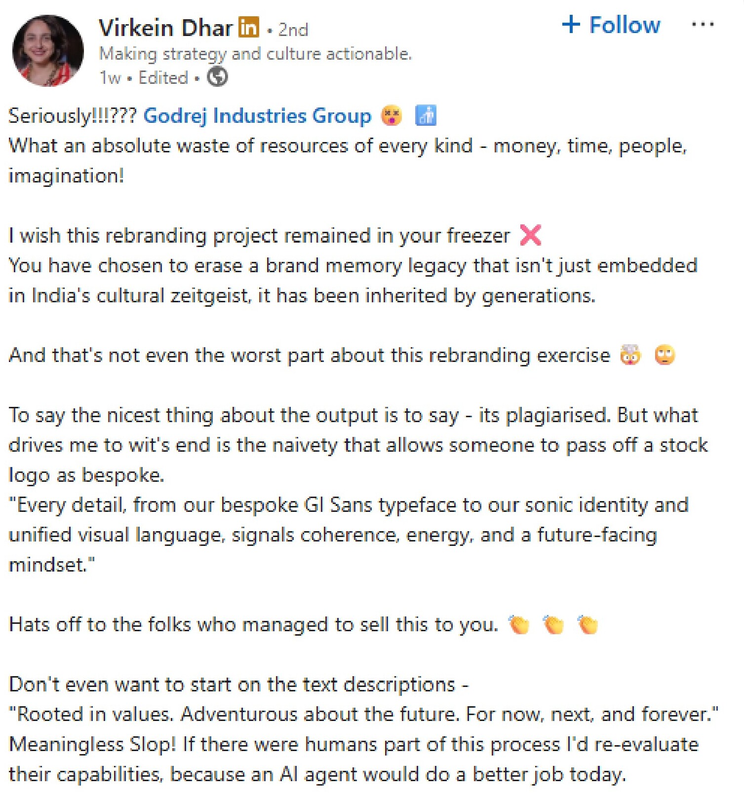
Like most brand controversies today, it started with a single post. An Instagram user first spotted the resemblance. Soon after, it was amplified by Virkein Dhar on LinkedIn, who called the rebrand an "absolute waste of resources" and questioned whether the identity was truly original, going as far as to label it a "stock logo" presented as custom work.
The post quickly gained traction. Designers, brand strategists, and marketers piled in, and comparisons multiplied, not just to Guerrilla, but to other brands as well. What began as a single observation turned into a wave of scrutiny that escalated faster than the brand could respond.
What Godrej Said About the Entire Situation
Godrej Industries Group responded with a measured, corporate stance. It clarified that the GI mark doesn't replace the signature logo, but serves as a corporate identifier for institutional audiences. The team also maintained that the design process was thorough, backed by IP due diligence, and free of legal or ethical conflicts.
On the similarity, their explanation leaned on design logic. In a world of minimal, geometric identities, overlap isn't unusual as the range of possible forms is inherently limited.
That argument holds. But it doesn't fully close the loop. Because if such overlaps are predictable, they're also preventable or, at the very least, detectable.
A Practitioner's Diagnosis: What Steps Were Missed
Govind Raikwar, co-founder and Head of Design & Video at Pipedream Studio, has spent years doing exactly this kind of brand and identity work. His reaction to the Godrej situation wasn't outrage but recognition. Recognition of a set of process failures he's seen in studios of all sizes, and works hard to prevent in his own work.
"For someone who has been working in branding and designing for so many years, this feels like a huge miss on the agency or internal team's part. With Godrej being a legacy brand with such a massive online presence, this instance isn't just a rebrand but also a responsibility that goes far beyond creating something visually appealing. It's research. It's strategic thinking."— Govind Raikwar, Co-Founder, Pipedream Studio
What's striking about Govind's perspective is the level at which he frames the failure. He's not talking about skipping a final check. Instead, he is focusing on an initial step that occurs before anything is even presented to a client.
He further mentions that, "There is one basic step that I always do, which even comes before moving to creating a vector version of the logo. Usually, I send concepts which are just sketches. And even those sketches, I always check on the Global Brand Database. If any existing logo looks similar to what I'm sharing, then I simply avoid that concept. My priority has always been on creating something fresh, unique, and original."
This is not an exotic or advanced design practice. It's due diligence at the sketch stage before a single polished vector is drawn, a concept deck is prepared, or a client meeting is scheduled. It's the difference between catching a problem in five minutes and catching it after a public launch has already gone wrong.
He also points to something that often gets lost in the technical conversation, the reputational dimension for the designer.
"There is a kind of first impression that I would be giving to my client. And they also do their own research when they see the concept I've shared. If they find out that I've copied from somewhere, even unintentionally, it is a huge negative point against me. That's why I never skip this step, no matter how small the project is."— Govind Raikwar, Co-Founder, Pipedream Studio
The Trademark Problem No One Is Talking About Enough

Govind raises a point that tends to get buried in the social media noise, the downstream trademark implications.
He says that, "Even from the point of view of trademarking, they are going to face issues because there is already a brand which kind of has the same logo. They won't be able to easily register their GI identifier as a trademark. Being such a big brand, they might even have to buy that icon from the other agency. This could lead to trademark and registration conflicts."
Godrej Industries Group and Guerrilla operate in different industries and geographies, which offers some legal cushion. But using a mark and securing its trademark are two different challenges. If Godrej seeks registration in markets where Guerrilla has prior rights, the process could get complicated and expensive.
What Should Have Happened Instead: A Process Checklist

The failures are always addressable, and Govind's practice at Pipedream Studio illustrates exactly how. Here's what rigorous identity work at this scale should have included:
- Database checks at sketch stage: Before any concept is presented to a client or stakeholder, run it through WIPO's Global Brand Database, the USPTO's TESS, and India's IP India portal. This catches most major conflicts long before they become public problems.
- External design review: Even for in-house teams with deep institutional knowledge, a critical external perspective is specifically valuable. It helps catch what proximity causes teams to miss.
- IP attorney involvement before finalisation: Trademark clearance is a design input, not a post-design checkbox. An attorney involved early can identify conflict risk while alternative directions are still viable.
- Expanded competitive scan for geometric marks: When a design is intentionally minimal and geometric, the review can't stop at exact matches. It needs to include structurally similar forms across industries and geographies, especially in sectors where corporate identity will coexist.
- Document everything: Godrej's strongest legal defence is its claim of an extensive design process. But a claim without documentation is a vulnerable one if challenged. A well-documented process is itself a form of brand protection.
Is Godrej Actually in Crisis?
Godrej Industries Group isn't in crisis. The core Godrej Group brand, built over 129 years, remains untouched where it matters most, on products consumers interact with daily. The GI mark is a corporate-layer identity, not a consumer-facing shift. The comparison to Guerrilla may be valid visually, but the intent behind each logo is fundamentally different. One signals creative distinctiveness, whereas the other unifies a complex business group.
The Internet Remembers Everything

What this moment really highlights is the environment in which brands now operate. Nothing is too small, too old, or too distant to be found.
A logo from 2002 isn't obscure anymore. It's instantly searchable and globally visible. Today, brands launch into an ecosystem where designers, strategists, and observers actively look for overlaps. They're armed with tools and communities that function like a real-time archive. It means missing a reference goes beyond being an oversight. It becomes a strong narrative on the internet.
That's where our perspective becomes critical. If individual designers treat originality checks as non-negotiable, even at the sketch stage, then gaps at a legacy-brand level aren't just about design. They point to deeper cracks in the process and in priorities.
To bring it full circle, here's how our co-founder sums it up, "When you're building for a brand of this scale, originality isn't optional. It's the baseline. Because in today's world, anything less will always be found out."